Cinematography has long been an essential tool in shaping a film’s mood and tone. One of the most captivating trends in visual storytelling is the use of pastel colors. These soft, muted tones have gained popularity in recent years, becoming a signature style in many films. Pastel cinematography, with its delicate blend of light and color, offers a visually stunning approach that evokes a sense of tranquility, nostalgia, and surreal beauty.
In this article, we will explore the aesthetic qualities of pastel cinematography, its history, how it impacts emotional storytelling, and why it continues to resonate with audiences and filmmakers alike.
What is Pastel Cinematography?
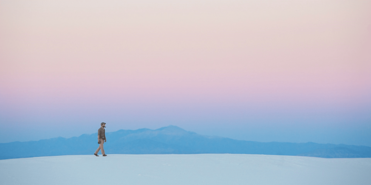
Pastel cinematography refers to the use of soft, light, and faded colors that dominate the screen, often in shades of pinks, blues, lavenders, and soft yellows. These hues are characterized by their low saturation and high lightness, giving them a dreamy, ethereal quality.
The colors are not just randomly chosen; they are carefully selected to complement the story and enhance the emotional undercurrent of a film. Pastel tones are not only used for their aesthetic value but also for their ability to create a specific atmosphere that can draw the audience deeper into the narrative.
In pastel cinematography, the focus is often on the subtleties of light, the way colors interact with each other, and how they shape the mood of the scenes. The soft nature of these colors allows filmmakers to play with shadows, creating a sense of intimacy or distance, depending on the emotional tone of the scene.
The Emotional Impact of Pastel Colors
The use of pastel colors in cinematography is not merely a visual choice—it’s an emotional one. Colors have long been associated with psychological responses, and pastel tones, in particular, are known to evoke a sense of calm, nostalgia, and serenity.
For example, soft pinks and purples often evoke feelings of romance, tenderness, and warmth. Blue hues, on the other hand, can elicit feelings of melancholy, nostalgia, or even tranquility. The beauty of pastel cinematography lies in its ability to tap into these emotional cues, subtly guiding the viewer’s emotional journey throughout the film.
In contrast to more intense, saturated color palettes that can create high-energy or dramatic effects, pastel cinematography often conveys a sense of quiet beauty, allowing the audience to reflect and connect more deeply with the story. This makes it a powerful tool for films that explore themes of love, memory, or emotional introspection.
A History of Pastel Cinematography in Film
The use of pastel tones in film can be traced back to the early days of cinema, though it wasn’t until the mid-20th century that pastel colors began to take center stage.
One of the most notable examples of pastel cinematography is seen in the films of Wes Anderson, particularly The Grand Budapest Hotel (2014). Anderson has become synonymous with the use of vivid yet controlled color palettes, often dominated by pastel tones that give his films their signature, whimsical quality. In The Grand Budapest Hotel, the soft pinks, blues, and purples create an almost fairytale-like atmosphere, enhancing the film’s sense of nostalgia and dreaminess.
Another director who has embraced pastel cinematography is Sofia Coppola. Her films, such as Lost in Translation (2003) and The Virgin Suicides (1999), use pastel tones to evoke a sense of delicate beauty and emotional distance. Coppola’s films often explore themes of isolation and introspection, and the use of soft, muted colors reflects this internal, contemplative world.
While pastel cinematography may seem like a modern trend, it has roots in earlier filmmaking movements, such as the 1950s Technicolor films and the aesthetic of French New Wave cinema. In films like The Umbrellas of Cherbourg (1964), director Jacques Demy used soft pastel shades to create a whimsical, emotionally charged atmosphere. The film’s lush color palette adds to the sense of longing and heartache, elevating the emotional depth of the story.
Why Filmmakers Choose Pastel Cinematography
Pastel cinematography is not just about creating a visually appealing image; it is a deliberate choice made by filmmakers to enhance the story and connect with the audience on a deeper emotional level. There are several reasons why filmmakers choose to use pastel tones in their films.
1. To Establish Mood and Atmosphere
Pastel cinematography is often used to create a specific mood or atmosphere. For example, pastel hues can evoke a sense of nostalgia, dreaminess, or surreal beauty. In films that explore themes of memory, childhood, or emotional reflection, pastel tones can help immerse the audience in a world that feels both intimate and otherworldly. This is particularly true for films with a romantic or melancholic undertone.
2. To Enhance Visual Aesthetics
Pastel tones create a soft, delicate visual style that appeals to the eye. The gentle interplay of light and color adds depth and texture to the cinematography. The muted tones allow for a more nuanced exploration of light and shadow, creating an ethereal and otherworldly quality to the images. This is often used in films that prioritize aesthetics and visual storytelling.
3. To Reflect Character Development
In many cases, pastel cinematography is used to reflect the inner world of a character. As characters undergo emotional transformations or grapple with their own feelings, the colors surrounding them can change to reflect this journey. The use of pastel tones can symbolize the fragility of a character’s emotional state, suggesting vulnerability, tenderness, or even a sense of escape from reality.
4. To Play with Contrast
While pastel cinematography is characterized by soft colors, it can also be used in contrast with darker or more saturated colors. This contrast draws attention to certain aspects of the scene, whether it’s a character’s expression, a symbolic object, or a moment of emotional significance. The combination of pastels with more intense colors can heighten the drama and create visual tension that enhances the emotional depth of the film.
Iconic Films and Their Pastel Cinematography
Some of the most iconic films of the past few decades have embraced pastel cinematography in their visual storytelling. These films not only showcase the beauty of pastel tones but also demonstrate how color can enhance the overall experience of a film.
1. The Grand Budapest Hotel (2014)
Wes Anderson’s The Grand Budapest Hotel is a masterclass in pastel cinematography. From the pastel pinks and purples of the hotel’s interiors to the soft hues of the outdoor landscapes, the film uses color to create a whimsical, dreamlike atmosphere. The pastel colors complement the film’s nostalgic tone, transporting the audience into a world that feels both timeless and fleeting.
2. The Virgin Suicides (1999)
Sofia Coppola’s The Virgin Suicides is another example of a film that uses pastel cinematography to create a sense of beauty and longing. The soft pinks and blues that dominate the film’s color palette add to the melancholic atmosphere, reflecting the tragic fate of the Lisbon sisters and the emotional distance that permeates the story.
3. Moonrise Kingdom (2012)
In Moonrise Kingdom, Wes Anderson again uses pastel cinematography to evoke a sense of innocence and childhood fantasy. The soft yellows, greens, and pinks that dominate the film’s color palette mirror the purity of the young characters’ love and the idyllic, whimsical world they inhabit.
The Future of Pastel Cinematography
Pastel cinematography is not a passing trend but rather a visual language that continues to evolve and resonate with filmmakers and audiences. As the boundaries of storytelling and film technology continue to push forward, pastel cinematography will likely remain a powerful tool for creating visually striking films that evoke deep emotional connections.
The trend may evolve as new filmmaking techniques and technologies emerge, but the timeless beauty of pastel colors will continue to captivate filmmakers and viewers alike. Whether used to express delicate beauty, nostalgia, or emotional vulnerability, pastel cinematography will remain an integral part of visual storytelling for years to come.
In conclusion, pastel cinematography has emerged as a powerful tool for filmmakers seeking to create films that resonate with both the eye and the heart. The use of soft, muted tones allows for a deeper emotional connection to the story, enhancing the narrative and visual impact of the film. With its rich history and enduring appeal, pastel cinematography is a visual style that will continue to shape the future of cinema for generations to come.


